Alan Rusbridger, the editor of The Guardian newspaper, was recently asked by a UK home affairs committee investigating the Snowden leaks, “Do you love this country?” This is not a question I will answer, but I do find myself asking a similar question of software developers – “Do you love your users?” Or, put another way, “Why do you hate your users?”
As the developer of Archi, the free ArchiMate modelling tool, I’ve put in many hours of my time, and much soul-searching, trying to create an application that works simply and elegantly, hiding complexity from the user and, above all, not crashing. I’ve thought deeply about what users want and what they probably don’t want, and I’ve listened to, and responded to, user feedback. So my answer to the question, “Do you love your users?” is unequivocally, “Yes!”
I’d like to illustrate this with an example of the process of thinking about usability in my software, and finish with an example of “user hatred” in another piece of software.
Show me the love…
I just implemented a new feature in Archi – to let the user define the line colour of a selected object in a diagram. This wasn’t too difficult, I just followed the standard presentation in the Properties pane. But then it got a bit more complicated when I added an additional option to derive the selected object’s line colour from its fill colour. Again, this wasn’t too hard, but it did present a usability challenge – one option negates the other. If the latter option is selected in the application’s global preferences, then any user line colours are ignored. So how would this look in the object’s Properties pane?
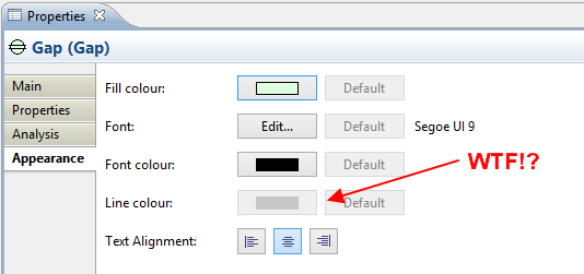
The problem is that the line colour selector buttons are always disabled. Whatever you do, they remain disabled since the global preference is set to derive line colours from the object’s fill colour. So why on earth are the buttons there? Perhaps the user needs to do something special to the selected object to enable them? Search in the user manual? Perhaps phone the help-desk? As it stands, this is a perfect example of the software designer hating their users. It’s the equivalent of inviting someone to dinner and then hiding the food in the cupboard.
So let’s show some love and try and solve the problem. Let’s kindly explain to the user that if they want to set their own line colour, they should have not been so stupid to have set it in the application’s preferences in the first place:
Well, why should the user have to do that? They can’t even remember where the preferences are, let alone which preference to look for. Out with the manual again!
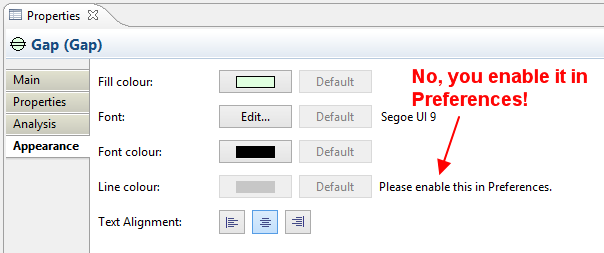
Perhaps the better solution is to not only explain why the feature is disabled, but also to offer a link that will open the preferences dialog window and take the user to the preference that will solve the problem:
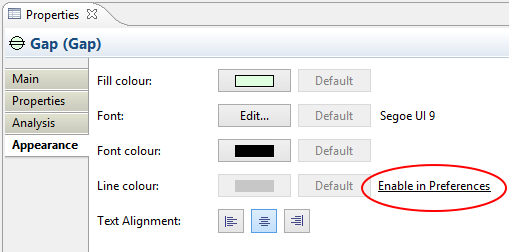
Clicking the link takes the user to the Preferences dialog window:
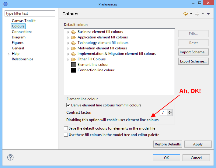
This is not a perfect solution, since the user has to think about whether to disable or enable the option. However, it’s a lot better than before. But wait…
…why not just completely hide the colour buttons in the Properties pane when the feature is not available? This way you wouldn’t even need to show an explanatory text and link. Well, I thought about this and this creates a different problem – the user might never know that the line colour feature exists. By greying out the buttons I’m providing a hint to the user that the feature is available under some circumstances. The additional explanatory text and link then takes the user to the preferences dialog so that they can see for themselves how and why this is an option – coaching and coaxing the user.
Even this solution sucks. There are just too many buttons cluttering up the screen. Back to the drawing board.
This is better:
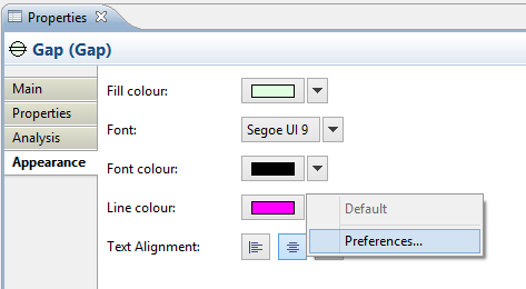
Here I’ve combined all buttons into one control – the colour selector, as before, and the “Default” and “Preferences” into a drop-down menu available from the right of the selector. I even re-used the control for the Font selector. Nice.
And now for something completely different…
That is a small example of the process I go through when demonstrating the love I have for Archi’s users. But what about software developers who seem to hate their users? I give you Protégé, an open source ontology editor from Stanford University. Here’s the opening screen on Windows:
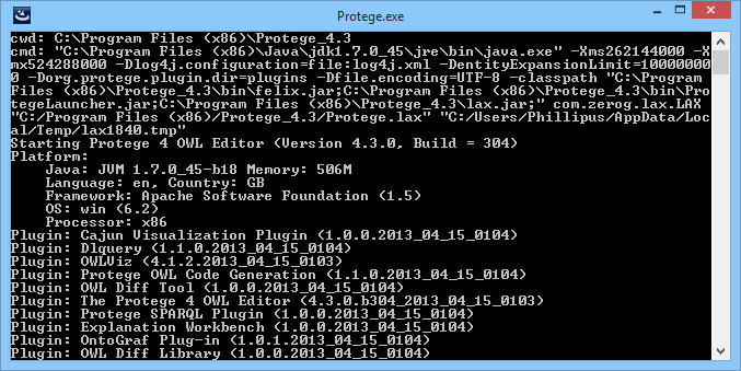
This just broke Software Rule #1 – Don’t Throw Shit at the User.
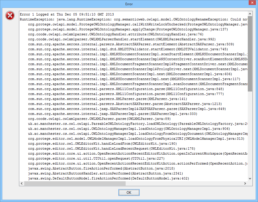
Ok, how about simply opening a file in the current editor window? Here’s the result:
Protégé also has a menu item called “Refresh User Interface“. Really? You don’t get a dog and bark yourself. Come on, this is supposed to be Stanford Frickin’ University.
You know what? I think the Protégé developers hate their users.